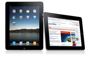
 For the most part, Connected are an Apple loving company so there was a lot of excitement among us yesterday as we awaited the arrival of Apple’s latest piece of kit. Despite my initial scepticism when it was announced, my opinion quickly changed and I couldn’t wait to get my hands on it.
I had the good fortune of being the one who had first dibs on the little critter so like a child at Christmas I opened it up, threw away the “Start up guide” (who needs them really) and fired it up. Aside from the physical device itself, the interface is a thing of beauty. Yes, the home screen does resemble the iPhone but as an iPhone user, that meant instant recognition of the User Interface (UI) and within a minute (literally), I had email, contacts, calendars and bookmarks all synced from my MobileMe and GoogleMail accounts. Obviously, this is in part due to the transferability of account information afforded to us by cloud computing.
I spent a bit of time getting reacquainted with my Inbox using the Mail client, responding to email, filing etc and the whole process feels like a seamless linear task. Holding the device landscape you get a fairly conventional layout displaying the contents of your inbox (or folder if you’re looking through your stored mail) with your selected email on the right. Turning the device to a portrait position allows you to focus on your chosen email, hiding the inbox/folder contents within a button in the top menu bar allowing you to access the information when you need it.
Of course I was still working so I did have to put it down and get on with other things but I periodically took a short break to browse various websites, reading blogs and news items and for me this has been the most eye opening experience so far.
I take a great interest in web design and read many blogs which are (like my personal site) designed in a way that each article or blog post is individually designed to fit the content, much like printed magazines, and I think the iPad makes this type of implementation really stand out. Ironically, they seem to resemble magazine articles more than blogs or websites.
This isn’t limited to design based sites either, all the sites I visited had a fresh new look about them, they suddenly became easier to navigate and information was more digestible. I must point out, this opinion is based on the orientation of the iPad being held portrait. Bizarrely, turning it to landscape, I think sites become normal again.
Room with (more of) a view
The problem with landscape is the orientation is the same as what we’re used to on computers, it’s the same letterbox shaped window with the site’s header, navigation and maybe the top 5 lines of body copy.
Turning it portrait opens up 50% more screen real estate which gives you a much better view of the information available on a page allowing your eye to digest more in one go. This view is very subjective and many sites I visited I was already familiar with the site’s layout and structure so others may (and will) have a different opinion on the matter. One thing for sure is if tablet computing picks up speed and becomes as ubiquitous as smartphones, it’ll add a whole new dimension to the fun debate of “the fold”
There are obviously downsides to getting to play with this early, namely the absence of the iPad app store (it’s currently only open in the US). My first 24 hours with the device was limited by what you can do with it’s native apps, which to be fair is quite a lot, but the real test will be when apps become available and I can test out the apps I use regularly on my iPhone to see how they fair.
Overall my opinion is set, I want an iPad of my own that I can carry around with me. I’d love to hear your opinions on the device, have you got one early? What do you think of it? What impact will it have on our day-to-day lives?
