By Martin Dower
[marker ]Reading time is circa 7 minutes[/marker]
The world of digital design has changed hugely over the last couple of years, caused by:
- The explosive adoption of tablet and mobile pushing the digital world to responsive thinking
- A shift from designed web-site to providing digital services
- Emergence of digital services frameworks to simplify design, serving and support
- A “less is more” mantra that sees applications, web-sites and services focussed around the need of users
- Bring Your Own Device (BYOD) liberating the workplace for millions
- Death of the PC as the dominant internet device
 Most, if not all, of this has happened since 2011 and not everyone in the design world gets it yet. The role of brand in the digital space has changed and taking a back-seat in how the services are constructed and displayed. With two-thirds of digital agencies freely admitting they don’t understand the mobile space it’s no wonder that the digital design world is behind.
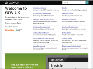
Recently, the awkwardly dull Gov.uk web-site won the highly prestigious Design of the Year award. It’s likely that you will be visually underwhelmed but take a look at the design principles behind the new site and it’s makes a lot more sense:
Start with needs. Ignore brand and aim at what the punter wants. Start by identifying and thinking about real user needs and design around those. Make a huge effort to understand those needs properly. Avoid assumptions and execute HiPPOs.
Do less. Focus for what the digital service or application should do – shun extras and nice-to-haves. Stop re-inventing the wheel and needlessly replicating services. Think about others in this space, if other folks are doing interesting stuff then make it easy for them to communicate at a technological level. Concentrate on the irreducible core – it is cheaper, faster and less cluttered.
Design with data. Most web presences are on their nth iteration so lots of data and information we can learn from; which services and applications are used and which are ignored. This learning should be incorporated into whatever we deploy next – it is is the great advantage of digital services — we can watch and learn from user behaviour, shaping the system to fit what people naturally choose to do rather than bending them to a system we’ve invented.
Do the hard work to make it simple. Simple is not that simple to do and a great deal of thought and planning needs to go into making the services simple to use as well as simple looking; they are not the same thing.
Iterate. Then iterate again. Staying agile is core to making digital services a success, it flows through so much of the processes that everyone must buy in. Cost and user-effective services always start with a Minimum Viable Product (MVP) and then grow from there based on feedback from users and data. The agile approach turns the cost of failure into valuable learning that can be added into the next version.
Build for inclusion. Good digital services should work for pretty much everyone so accessibility needs building into the core. This takes precedent over elegance, always.
Understand context. Stop designing for screens, we create services for people so must consider where they are, what they are using, how they are interacting and why. The plethora of new digital service devices (mobile, tablet, watch, glasses, coffee table, free-space gesture computing etc) mean a proper re-think. Not everyone has a 27 inch iMac.
Build digital services, not websites. Say no more, it’s not a web design project anymore than designing a cruise ship is a sculpture exercise. Your digital services are only part of the story and your customer journey has a lots of off and near-line elements. All these steps on the user journey need to be factored in. Right now, the best way to deliver digital services is via the web — but that might change, and sooner than we might expect.
Be consistent, not uniform. Pragmatic. Keep the same design cues that folks are comfortable with, it avoids forced-learning but don’t be overly precious so encourage flexibility in how digital services are delivered, especially when this better meets the needs of the user.
Make things open, it makes things better. Proprietary is dead, replaced with open frameworks, data structures and collaboration. This extends beyond the physical code and into development methodologies, content creation, project management and the whole gamut of what was once called web development. If everyone shared more of the technology and solutions the world would advance at a faster pace. Our approach is a little different to most web development companies; we know the proprietary world well because for the first 15 years of our life we were just like them. We now share everything we do with the widest audience and get repaid a hundred times over for sharing – it really does work and creates long-term trust into our business relationships.
Interested in our approach? Contact us and we’ll get started on helping you with the future of digital services.
