Search Engines.
Google recently launched “Mobile Friendly” tag is looking likely to go mainstream in the next month or so.
Google championed mobile-first, and specifically Responsive Design (RWD), back in 2011 but they’re getting deadly serious about it now.
In the past, when Google has added new elements to it’s search algorithm it only made a vague reference to how they might work and not usually given much of a clue in terms of how useful they might be for search engine ranking.
 Not this time. Google have made it plain as day that they are going to give “mobile-friendly” sites a boost and even said when, April 21st.
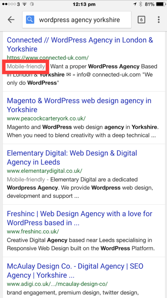
Searches carried out on mobile devices have, for a while, included a little tag (marked in red) for website that are mobile friendly. From the end of April, those sites are going to gain a measurable boost in their search engine ranking.
The amount of this lift is not known but the very fact that Google has been driving to improve the mobile experience, and the fact that it’s search service (and advertising) is dependent on a good mobile experience, so you can expect the boost to be usefully substantial.
It’s widely thought that Google has been a little disappointed with the rate of adoption of mobile-first and this somewhat heavy handed approach is how they’re going to deal with it. It’s a simple “Join the mobile-first club, or sod off”.
Mobile-first is such an obvious approach to building web sites and digital services that it’s surprising that any web-site fails to use this approach. Often this is caused by legacy issues surrounding web development practices that are up to a decade out of date.
Getting organisations to change their whole web development ethos is now easy. Usefully, platforms such as WordPress allow a simple and relatively low-cost transition to modern web standards but many traditional programmers and IT departments are too slow to adapt and many have a snob-based view of using modern platforms – preferring to continue the practice of proprietary, hand-cut development. These organisations will lose out.
It should be noted, “Mobile Friendly” is more than just using Responsive Design. The web-site has a number of usability hoops to jump through as well as ensuring ALL the content is viewable by the Google Crawler and none of the CSS or plugin code is blocked from being crawled. So tread carefully.
 Usefully, Google have provided a tool to check your site. This neatly tests your site and gives you a big “Awesome” thumbs up if you’re friendly.
Google are becoming more and more prescriptive of how the web should look and operate. This won’t be the last “do or die” initiative they roll out. We’d expect to see sterner penalties for non-secure sites and incorrect use of meta data. Watch this space.
