Ever since man invented the wheel, there’s always been some creative-type trying to decorate it. Sometimes that has worked, more times not.
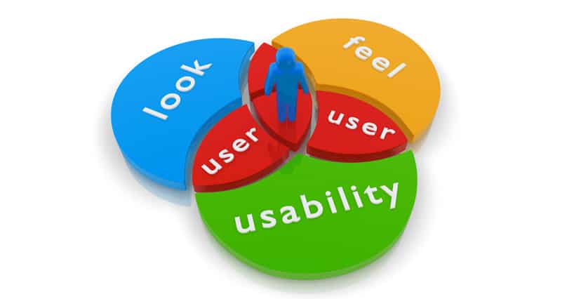
Design in isolation will always fail – to succeed it must enhance function and, ideally, simplify the experience.
The tension between the function and form is healthy, digital services are always better if their look is balanced and consistent with sister services. And we all like things that are pleasing on the eye.
Take a look at the great work done by the GDS on the many hundreds of UK government websites, the work was so seminal it won a Design Award and was described as “..the Paul Smith of web sites”.
So, whilst we can appreciate the clarity of a sterile and efficient Government web-site, what happens when we’re trying to convey brand values via styling cues and other design elements?
Lets step back a couple of paces
Firstly, the consumer is stepping away from old-world values – often called the 4Ps (Price, Product, Place and Promotion) – and seeking more an authentic experience. This, in many ways, makes the old design rules redundant.
Today, consumers are basing their purchasing decisions within the digital world around a new TLA (sic). The 4Is; Impression (Do I like what this brand has to offer?), Interaction (Does it keep promises?), Responsiveness (do they listen and respond?) and Resilience (do they give a toss about me?) offers a simple way to understand this new consumer paradigm.
So what the hell has that got to do with design and function?
Well, consumers now expect a product to be more than a bunch of features shown off with some nice photography. They are seeking an understanding of what the brand stands for, it’s core values and the way it treats its customers.
So, fewer pretty pictures and greater consumer engagement are today’s marketing mantras. This has dramatically changed the consumer space in the last 10 years and those companies that didn’t listen to consumers, or not matched values have lost out big-style.
Think Microsoft, Sony, Major Record Labels, General Motors, M&S … the list goes on.
The winners? Apple, Amazon, Zappos, Tesla, Spotify, Netflix – none of these were world-sized businesses 25 years ago and now they are, due in a large part by listening and being functional.
The winners share one thing in common: The form is dictated by the function. Each has great product offerings first and then great packaging (design) second.
Why design at all?
Good design makes a product better to use, great design can make a product disruptive. The packaging, or brochure, or marketing is simply a function of conveying those great bits with the right DNA injected. It’s also very authentic, it’s a real representation of what the company is like.
Good design also makes you think about products from a users’ point of view. Be careful never to lose sight of that,
Design goes bad, often caused by inward-thinking and a return-to-type approach of product-based marketing. If you mouth the mantra; “the experience is more important than the product” then you’ll go a long way to avoid design killing your product.
Risks and things to watch for
Product evolution tells us that after a while the product will stop giant evolutionary leaps. When this happens it’s tempting to decorate it. This is a luxury, and should only be done when there is nothing left to do on the functional front.
Focussing on visual experience and small aesthetic details can help differentiate your product if the market is crowded. And certainly adopting current design trends (flat UI, Metro blocks, thin fonts) will help an older product look more modern.
It’s often said that a product is finished when no more can be taken away. It’s the inference that clutter and decoration serve no useful purpose and it’s a grand old aim.
But hacking away at old paint is tedious, and often poor design runs deeper – infecting the very structure of digital services.
New is easy. Right is hard
It’s very hard to make it simple, much harder than most folks realise. Conversely, it’s very easy to slap a new coat of paint on over the old.
So excessive design can be bad, it is a distraction that adds unnecessary crap to digital services, but decoration can be beautiful and enhance the user experience.
It all comes down to how it is implemented. Take it out there in the design world.
Originally published Jul 2014. Updated Jul 2020.

